Friday, 30 September 2011

All he wanted was a brain!

Better late than never I am here with my next piece as guest designer for September!
This time I've made a book using the Studio2Mers papers, the scarecrow stamp from The Octopode Factory and the Collections Elements Tiny alphabet
I used one of the papers to cover the covers of the book then stamped the scarecrow image onto a scrap of the paper, cut him out and added him to the cover.


To make him blend into the background paper I added some extra white dots around the stamped image. Next I used my sewing machine to stitch around the covers and then used the small card alphabet to add the quote.


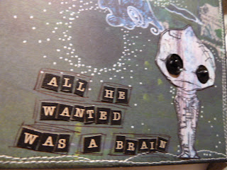


For the pages inside the book I folded three of the Studio2Mers papers into a concertina type design, these are then attached together at one of the flat surfaces to give a bigger fold out piece. This is then glued between the two covers trappping pieces of ribbon that are used to tie the book closed.

Sue Roddis

Tuesday, 27 September 2011

Artchix and Alter That Kits

We have lots of new products now on the website from ARTCHIX and not just there lovely image sheets but lots of other goodies from them.

And for those who fancy trying some of their products but dont want to buy packs we have put together an OCTOBER ALTER THAT KIT with lots of there products in

Wednesday, 21 September 2011

Home Sweet Home.

How cute are these little birdhouses!......they're from Collection Elements.

They don't take much decorating.....I covered mine with paper from an old atlas and scraps of red card.


The bird is covered with a little scrap of painted atlas paper.


The hearts were cut on a Big Shot.


Thursday, 15 September 2011

Jean - Basic Grey Olivia and a bit of scraping

I love Basic Grey and use it a lot when scrapbooking.So what better than a range named after my daughter Olivia. So I thought I would do a little scrapping with it.If you fancy some we have it in by the sheet for 50p or there is a 9 sheet pack for just £4.

We went to the NEC two years ago and saw the Hairy Bikers ,Olivia loves them so had her picture taken with them and we watched them cooking. The pinks in the Basic Grey Olivia go perfect so thought I would make a double layout with all the photo's we took.

Second page of the layout.

Tuesday, 13 September 2011

Julie: Ideas for The Octopode Factory stamps

Hello again.

My project today features an alternative interpretation of the Octopode Factory's 'Ghost' stamp becasue, rather than create a Halloween themed card with it, I've made something altogether prettier, frillier, and less spooky ....
As I so often do, when stamped this cutie on to a light coloured but patterned paper as I don't really feel inspired when I stamp directly on to plain white cardstock. I then added a little bit of colour to the girly-ghost using ProMarkers:
The backing designs to all 4 cards are from the same double-sided sheet of Studio2Mers paper which is pink and purple toned on one side with shades of coral and red on the reverse. The black flourish design paper [above] is from Collections Elements:
I added a rose cabochon for extra feminine flair:
Once again, those Studio2Mers I've been using in my last few posts here, feature those lovely 'I can't believe it's a printed design' touches like the doodled buildings above and these abstract doodles below:

Supplies used:
If you'd like to see a few more images from these not-so-ghoulish ghost stamps, pop over to my blog today.

I hope, next time you see a stamp you like, but which you think is too themed to regularly use ... you'll look at it again and consider the alternatives. It's a great way to get the full value from one image.

I'll see you back here in 3 weeks .... or much sooner if you drop in on me.

Julie

Friday, 9 September 2011

Lots of Cards

That's all I feel I have been making with 2 of the stamp ranges we sell.I have done lots with the Octopode Factory steampunk range and then a few more with the Molly Bloom ones.
I will start by showing you the Octopode Factory ones today .

The two I chose from the range are Violette which is this one with the little pieces of watch parts which match her lovely watch hair.The other one I used was Nipper Siouxsie.

I think with them being steampunk that the kraft coloured card goes better than white. It's just a bit different.

Monday, 5 September 2011

Quoth the Raven....Nevermore


Hi, my name is SUE RODDIS and I have been asked to be the guest designer for SCATTERED SCARLET for the month of September.
This is the first of three pieces that I will share over the course of the month.
I used Collections Elements Victorian Antiquing tissue glued onto a canvas panel.THis was then coloured using watered down DISTRESS INKS
I then stamped the OCTOPODE FACTORY images......Edgar Allen Poe and The Raven onto card and coloured, cut out and added to the canvas panel.
The words were added using Collections Elements Upper Case Tiny Alphabet

Sunday, 4 September 2011

Guest Designer

Ooooo yes we have a great Guest Designer joining us for all of September. Her name is Sue Roddis and if you dont know her work , which is just lovely, well then pop over to her blog JABBERWOCKY , www.sroddis.blogspot.com
Her first post will be tomorrow so dont forget to drop by and have a look.

Thursday, 1 September 2011

Jan: Just sign on the dotted line


By the time this post appears I'll be on my way to New Zealand via Hong Kong. you didn't know ...where have you been? I'm off to watch the Rugby World Cup for 8 weeks. I'm a BIG rugby fan (not that big now I've joined Slimming World!) so I need a big autograph book to collect all those signatures. I've made mine from a couple of strips of chipboard that I covered with Basic Grey Out of Print paper. These are lovely papers, all different texts and finishes,some are clear, some look as though they have been gessoed. I'm hoping to get at least all the England squad so wish me luck.
Related Posts with Thumbnails